The color that suits your office depends on how much daylight the room gets, because dark shades like Sherwin-Williams Inkwell soak up both sun and lamplight, while white paint or a sunshine yellow holds whatever light is there.
The choices range from a single painted accent wall to full-room burgundy or Million Dollar Red from Benjamin Moore, and the finish matters nearly as much as the shade.
1. Gray Paint Colors
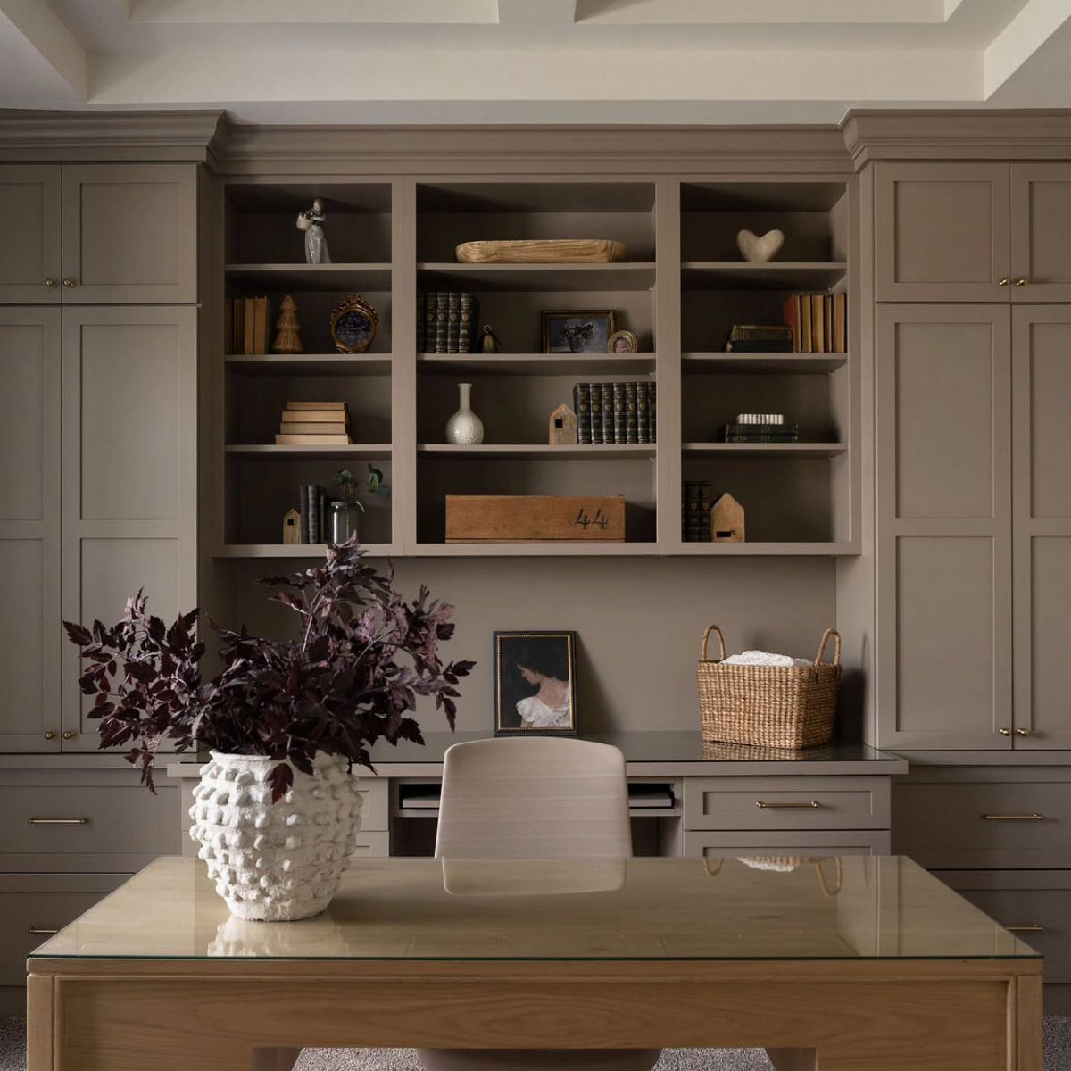
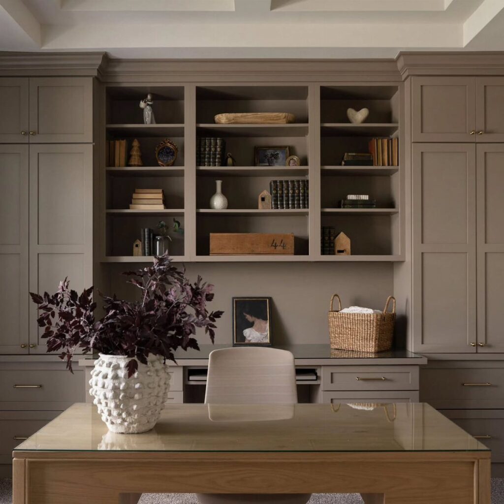
Gray works hardest when the cabinetry carries it. Painting built-in shelves and cabinets the same gray as the walls makes them read as one calm surface, and a wood desk adds the warmth gray lacks.
A single plant or vase with a purple leaf gives the eye somewhere to land. Gray with no accent can drift flat, so keep one color in the room on purpose.
For a first try, pick a mid-tone gray over a very light one. It hides shelf shadows better and looks deliberate.
2. Blue Paint Colors
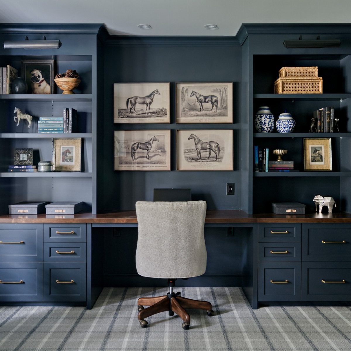
Deep blue on the built-ins is the move I’d copy. Painting the shelving and desk in the same color as the walls lets the whole wall settle into one calm block, which suits a room where you need to concentrate.
Blue is known for promoting calmness and focus, and a dark version adds weight. Pair it with warm wood or a beige chair so the room doesn’t turn cold.
Test a large swatch near your screen before committing, since blue shifts with the light.
3. Green Paint Colors
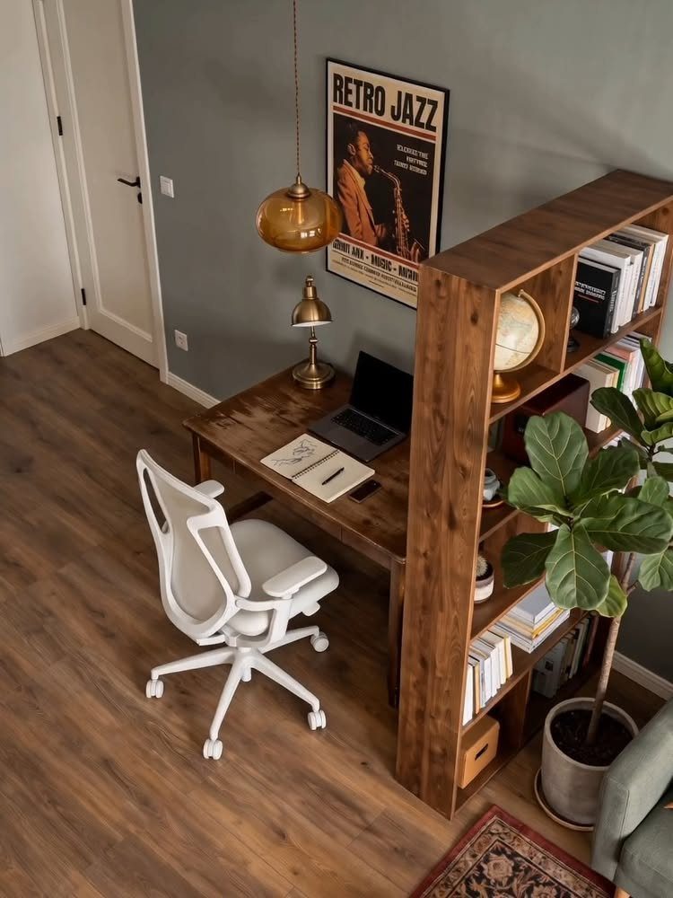
Muted green is the easiest color here to live with all day. It fosters balance and tranquility, and it sits well beside a wooden desk and a few houseplants without competing with them.
I’d choose a gray-leaning green over a bright one, especially if you spend hours at a monitor.
Paint one wall first if you’re unsure. A single green wall behind the desk also frames video calls nicely.
4. White Paint Colors
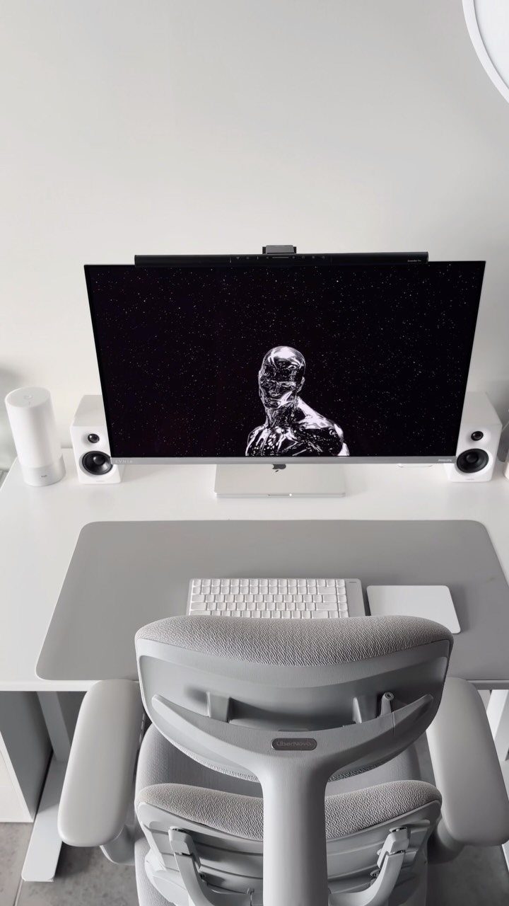
White keeps a small office clean and open, and the desk, walls and gear can all match for a minimalist look. A gray chair breaks up the white so the room doesn’t feel clinical.
My preference is a warm white over a stark one, because it’s gentler on the eyes after a full workday.
White walls show scuffs from a chair back fast, so keep a small can of touch-up paint on hand and fix marks as they appear.
White also leaves the monitor and speakers as the focus.
5. Sherwin Williams Inkwell
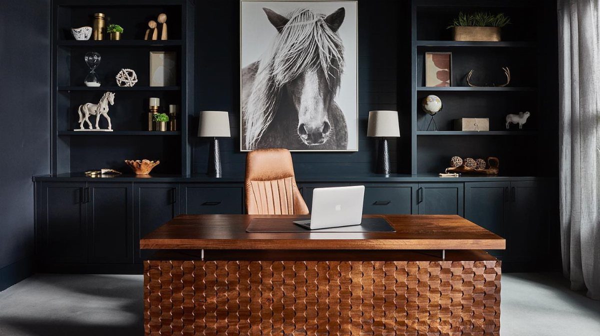
Inkwell from Sherwin-Williams is a very dark shade of blue, close to navy, and it makes a whole room feel enclosed in the best way. Built-in shelving painted to match gives it a custom look.
Pair it with a large wooden desk and a leather chair so the darkness reads rich instead of heavy. A big black-and-white print on the wall stands out well against it.
Plan on good lighting, since a color this deep soaks up daylight and lamps.
6. Dark Paint Colors
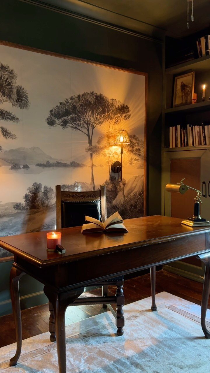
Dark green walls turn a corner into a reading-room office. Dark colors create a cozy, focused environment, and a wooden desk looks warmer against them.
Dark walls soak up light, so a wall lamp or 2 does more work here than it would in a pale room; warm 2700K bulbs keep the color from feeling flat after sunset.
A large mural or landscape print keeps the wall from feeling like a flat block.
If the room has little daylight, I’d still go dark, but commit to the lighting first.
7. Million Dollar Red by Benjamin Moore
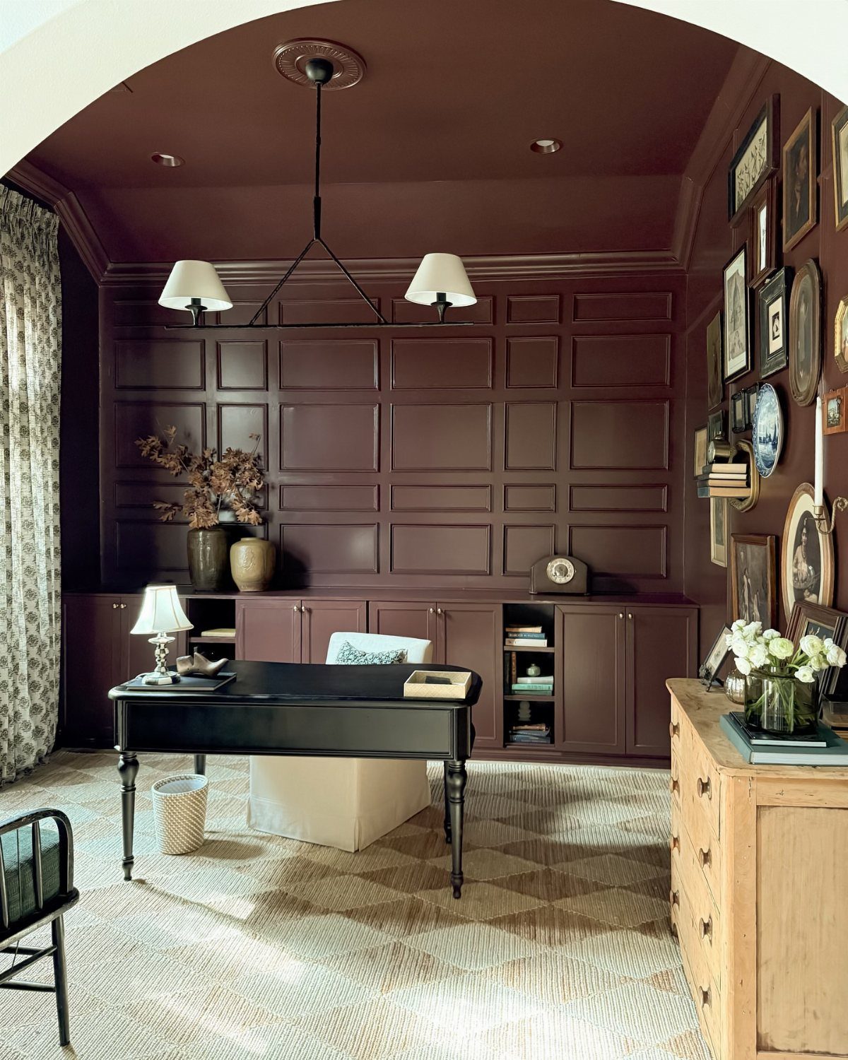
Deep red on paneled walls turns a home office into a room with real presence. Million Dollar Red from Benjamin Moore is a bold pick, and a black desk with a white chair keeps it from swallowing the space.
A gallery wall of framed art can hold its own against a color this strong, as long as the frames stay simple and the mats are white or cream. Matching frames keep it tidy.
Before you commit to a gallon, get a peel-and-stick sample from Samplize and tape it up for a few days to see how it reads in your light.
Stick it on the wall and look at it morning and evening, since red changes more than most colors.
8. Rosemary by Sherwin-Williams
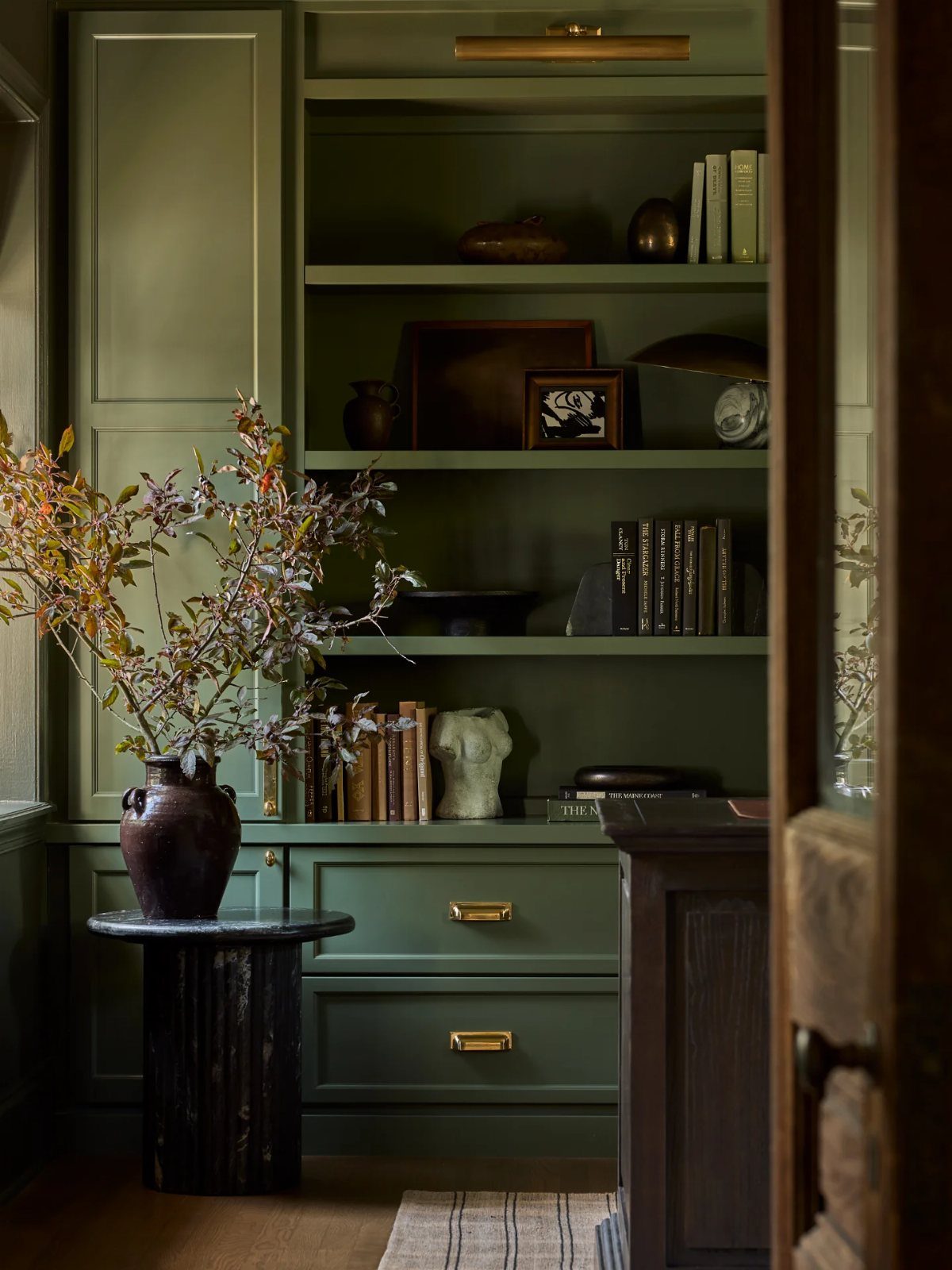
Painting built-in bookshelves and the walls around them in one olive green makes the whole corner feel like part of the room instead of furniture pushed against it. Rosemary (SW 6187) from Sherwin-Williams has earthy undertones that suit this well.
Dark wood furniture sits comfortably beside it, and a vase of branches on a shelf adds to the natural look.
I’d paint the shelf interiors too. Books and decor stand out against the green, and it takes only a little extra time.
9. Sunshine Yellow
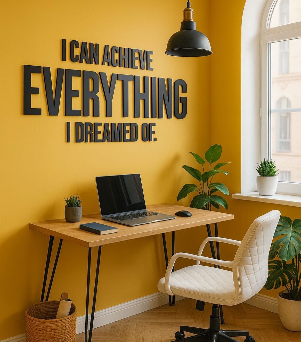
Yellow walls wake a room up, and yellow is tied to creativity, excitement and innovation, which suits a desk where you brainstorm.
I’d go for a softer, buttery yellow if you work at a screen all day, since a saturated one can tire the eyes.
Black wall lettering with a favorite phrase is a cheap way to add personality once the paint dries.
“Brighter, more saturated colors can be a great way to enliven a home office space. Using colors that may be more independent from the palettes in other home spaces can also help create an emotional division, helping to establish a bit more work/life balance.”
— Bob Vila
10. Burgundy Paint
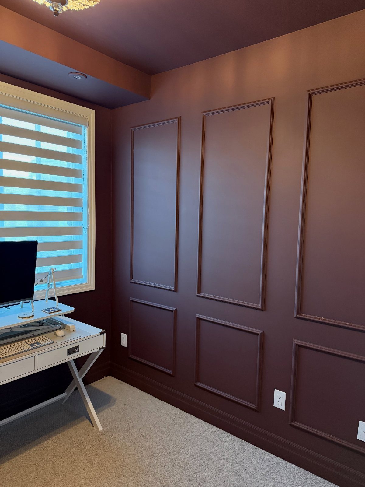
Burgundy works best with picture frame molding, because the raised trim gives the deep color some structure. Paint the molding and the wall inside it the same burgundy so the shapes read as shadow and texture.
A white desk keeps the room from feeling heavy and gives the monitor a clean base.
Blinds or sheer curtains help here. Burgundy is a dark color, so let in daylight where you can and test a sample first.
11. Mauve Paint
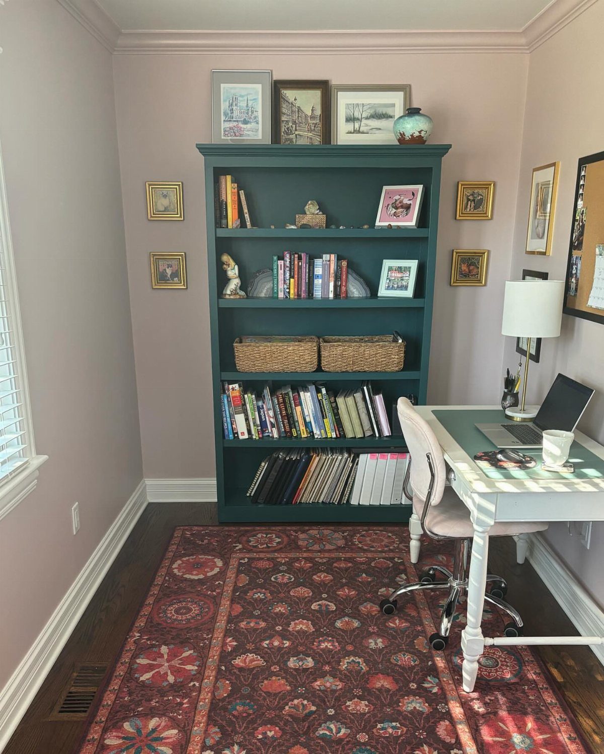
Dusty mauve is softer than most people expect, and it gets interesting when it sits next to a dark teal bookcase. The two colors balance each other without either one shouting.
A white desk keeps the setup light, and dark wood floors anchor everything.
My advice is to paint the bookcase first or choose the teal before the mauve, since the wall color is easier to adjust around a bold piece than the other way around.
12. Abstract Painted Accent Wall
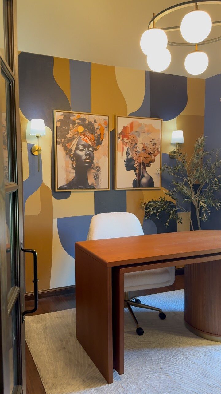
A painted abstract wall lets you add color without committing the whole room. Blue and yellow shapes behind a wooden desk give a home office a playful focus, and the rest of the walls can stay quiet.
Use painter’s tape to mark the edges of each shape, and sketch the layout on paper before you start. 2 colors keep the design from getting messy.
Framed portraits and a plain white chair work well here, because the wall already supplies the energy.
Choosing the Right Finish
Finish matters as much as color on office walls. I recommend eggshell: it has a slight sheen that wipes clean but stays quiet under a desk lamp or a monitor’s glow.
For a finish with zero sheen, flat is the one to pick, though it marks easily and scuffs when you wipe it. Skip satin and semi-gloss on the walls, since they catch light and show every roller mark and patch.
If you’re stuck on color, ask yourself which one gives off pleasant vibes when you picture sitting there at 9 a.m.
It sounds a bit woo-woo, but picking the shade that makes you feel calmest is a fair way to break a tie between 2 close colors.
Light neutrals are worth a look. Benjamin Moore Shoreline is a crisp, calming light gray.
Classic Gray is a light, bright gray with a warmth that keeps it from turning cold. Full Moon is a fresh, calming white that holds its brightness in a room with north-facing windows.
Pale Oak reads beige but carries a green undertone, and that undertone gets stronger next to wood tones and furnishings.
Furniture and Decor Accents
Start by figuring out whether your wall color runs warm or cool. Then keep rugs, pillows, lamps and desk accessories in that same family, and the pieces will mesh without much effort.
This works with a monochromatic room or a bolder palette. Matching undertones matter more than matching exact shades.
If the whole room feels too safe, paint a single wall in a bold color. It becomes the focal point, and everything else can stay calm around it.
Put that wall where your eye lands when you look up from the screen, and let the accessories echo its undertone.
Creating a Productive Environment
Paint sets the mood, but the chair and desk decide how you feel at 4 p.m. My first dollars go to the chair and desk, because comfort and support add up over 8 hours a day.
Keep the desk clear. A tidy desk with a place for everything means fewer distractions, and focus comes easier.
Pairing daylight with a lamp or 2 eases eye strain better than either source alone. Put the desk near a window if you can, and add a lamp for the rest of the day.
Tame cables with clips, a cord box or a sleeve, and give devices a spot in a drawer or basket. Last, a plant or a piece of art you like makes the room feel like yours.
Frequently Asked Questions
What is the most popular paint color for a home office?
Blue, gray and green are the usual picks. Deep blue on walls and built-ins suits focused work, a mid-tone gray hides shelf shadows, and a muted, gray-leaning green is easy to live with all day.
Add warm wood furniture or trim to keep any of these colors from skewing too cool.
What are calming colors for an office?
Soft blues, greens and light grays are the calming choices.
Benjamin Moore Shoreline stays crisp without turning icy, and Classic Gray brings enough warmth that it reads more soft than sterile. A muted green or a blue with warm wood nearby also keeps the room settled.
Which color paint gives positive energy?
Yellow is the best fit, since it’s tied to creativity and excitement. A soft, buttery yellow works better for screen work than a saturated one, which can strain your eyes over a long day.
A single painted accent wall in a brighter color is another way to add energy without covering the whole room.
What color is replacing beige in 2026?
Soft greens and warm neutrals are taking over from beige.
A gray-leaning green or an olive like Sherwin-Williams Rosemary (SW 6187) brings earthy warmth. Benjamin Moore Pale Oak sits in the same family but leans slightly green, especially when you place it next to wood tones.